
Exploring the mountains
In the late 2010's many businesses started selling cbd oil products. With Arrowsmith Herbal Healing we created a brand that was distinct, clear, and memorable.
Instant Relief
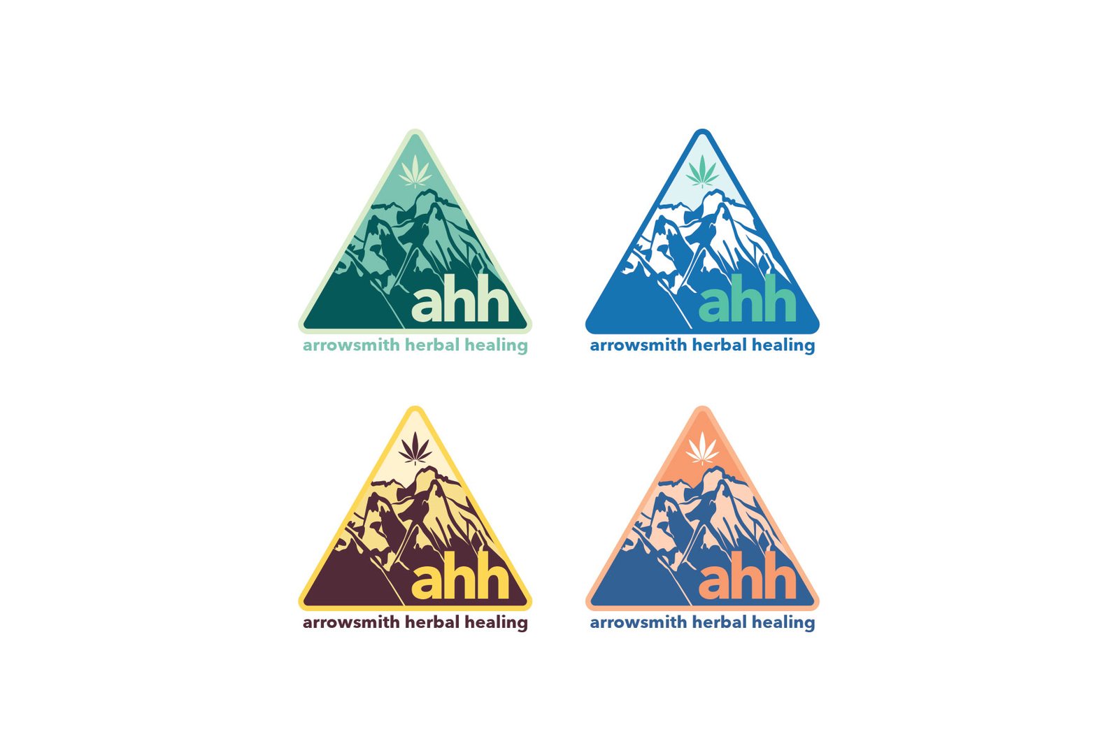
Many of AHH's clients use the product for relief from pains and other ailments. Others use this product line recreationally. The logo is a reflection of both the locality (Mount Arrowsmith is always looming in the region), as well as the tranquility one experiences at the top of the heights.
The final logo pairs an organic, hand-drawn mark with a calm, confident wordmark — simple enough to work on labels, signage, and packaging alike.

Business Cards
These business cards are used both in sales as well as in networking. For this aim, their backside uses a conventional layout to help potential clients quickly parse for the relevant information. The front has a background that has complementary colours in a simple look that is memorable and helps the logo stand out.
Concepts
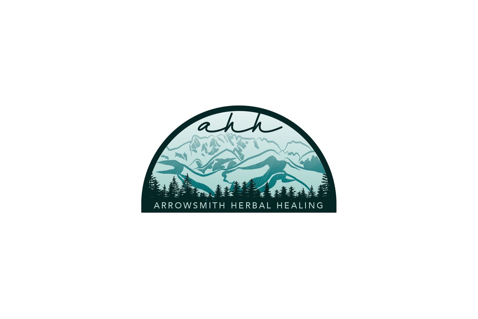
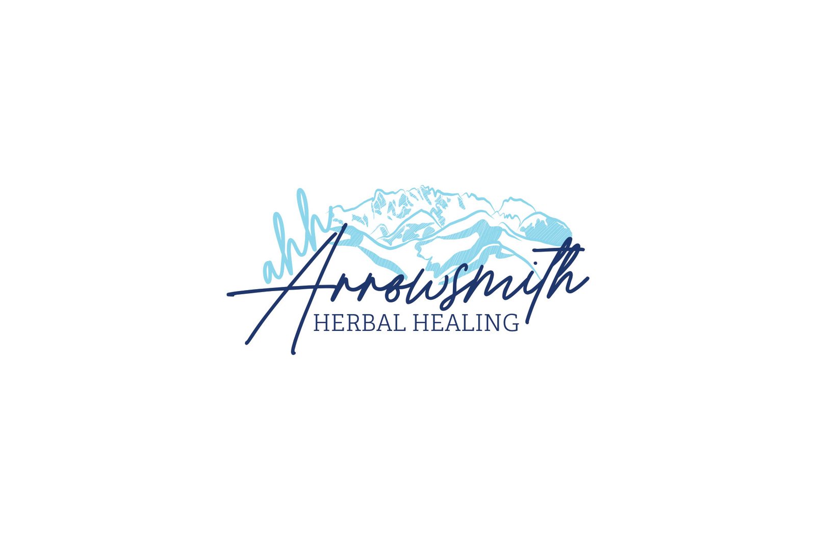
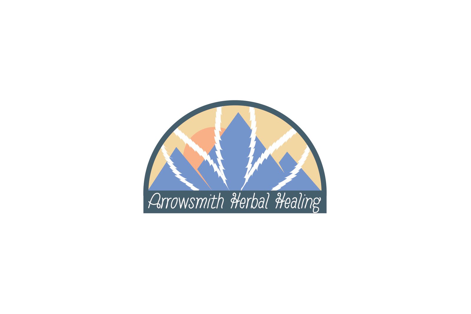
The requirements for this concept required four things: First, it had to be calm and serene. Next, it had to have the acronym “ahh”. Then, it had to show the mountain and finally it had to have the cannabis leaf.
Fonts & Colours
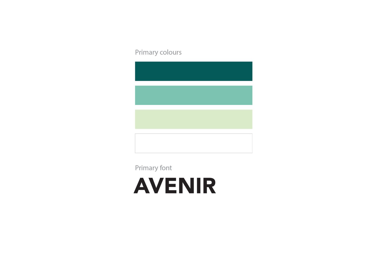
The type and colour system uses a warm, earthy palette paired with a soft serif and clean sans pairing for a natural, trustworthy feel.
T-Shirt Design
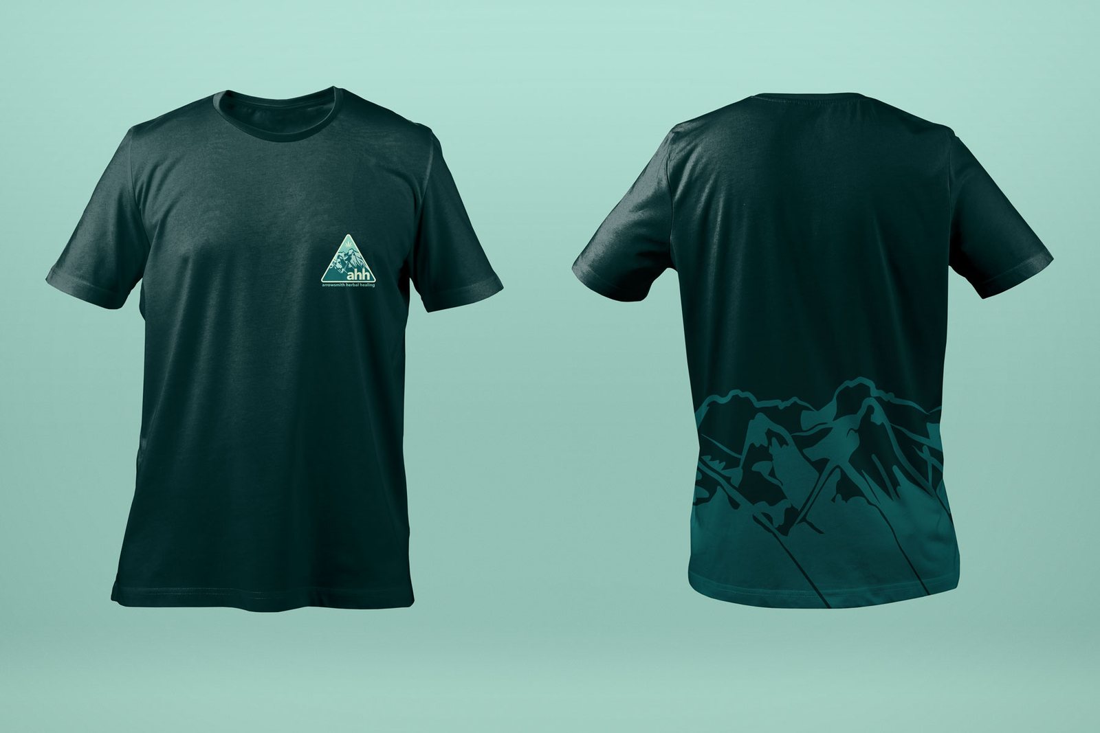
Staff apparel extends the calm, natural brand palette into an everyday wearable format.